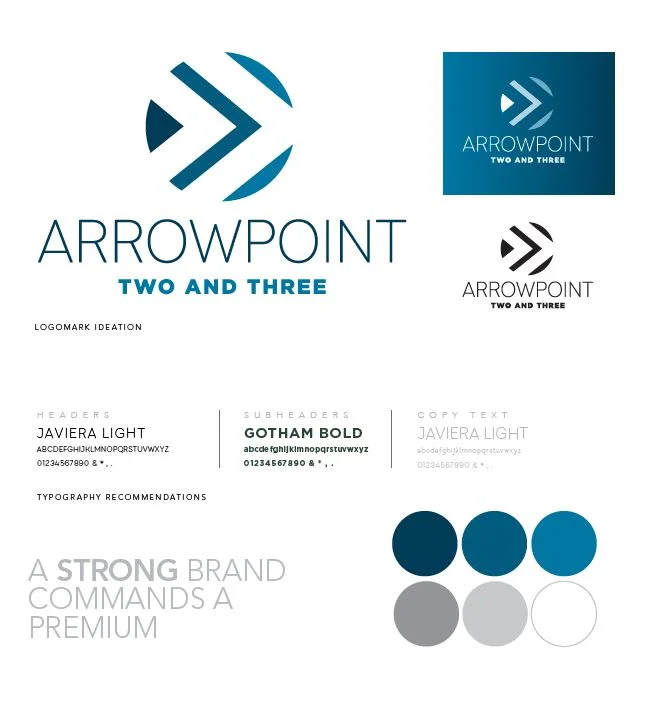
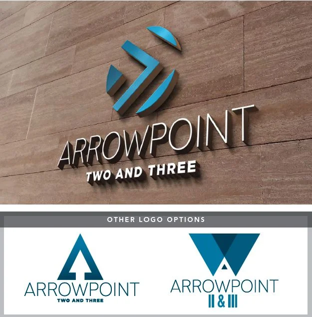

The re-brand of ArrowPoint II & III is transformative for these buildings, reinvigorating deals. The logo is fresh and clean, with a modern edge, and will attract the tech user ArrowPoint II appeals to, while still bringing a high class vibe to future tenants of ArrowPoint III.
The arrows in the logo don’t just reflect the ‘arrow’ and ‘point’ in the buildings’ name, but ripples in the water, as these two buildings sit on a tranquil pond. They are directed to the right, for forward thinking and innovation.
With this rebrand, ArrowPoint II & III are moving forward to something greater and new.